While there may be no such thing as bad publicity, you most certainly want your custom apparel to look great and advertise just as you intended. However, designing a good-looking custom printed t-shirt or hoodie can be complicated without a basic understanding of appropriate print placement. With extensive experience in the screen-printing industry, we have seen our fair share of bad print placements. In this guide, we take a look at common mistakes so you can avoid them and end up with branded apparel that looks great and represents your business or cause in a positive way.
Bad Print Placements on Apparel
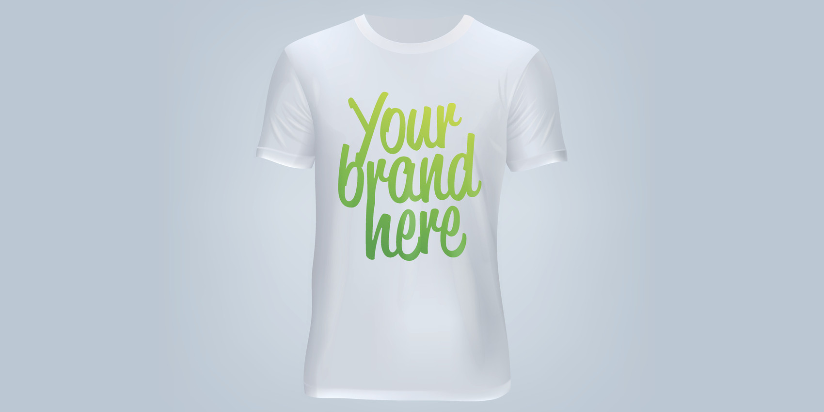
Where you decide to print the logo or wordmark of your brand on a t-shirt can make or break the overall design. Print placement is often confused with location, but what it actually refers to is the specific measurement of where to print the design within the standard front print area. In every custom apparel design project, there are several rules to keep in mind. The center point, otherwise known as the anchor point, of a standard front print area represents a boundary in which you can print abstract artwork, an emblem, a logo, a monogram, a symbol, typography, or a wordmark.
One of the biggest mistakes you can possibly make is assuming that the center of the standard front print area is the actual center of the t-shirt. In fact, the center of the standard front print area is in the middle of the chest. At this point, the anchor point, any typical design is able to extend outward and use up as much space as you envisioned. By choosing to place your print in the actual center of the t-shirt, you have coincidentally chosen the most unfortunate print location of all – the belly print. A print that is placed too low can be unflattering, which is not a good look if the purpose of your branded apparel is to generate buzz about your business, nonprofit, or sports team.
A lot will also depend on the size of your printed design. Adding a giant logo to your apparel may seem like a great idea, but the logo might end up looking way off-scale and somewhat ridiculous. Plus, your font choice will have a lot to do with the way the final design is received, especially in terms of typography. Choosing a timeless typeface might save you from having to redesign and redistribute your branded apparel down the road. You should avoid printing letters in a long, vertical line because that could make the message too difficult to read or easily misconstrued.
MSP Design Group has more than 30 years of experience in screen-printing and design. We can help you create the perfect look for your apparel and ensure that you avoid bad print placements when it comes to designing custom apparel. Please feel free to contact us with any questions about this guide, our selection, or our promotional services.