
When choosing a company to bring your brand to life in vibrant detail and high quality end results, MSP Design Group has over 18 years of experience creating products of such impeccable standards. What sets us apart from other companies? We have a highly skilled team of graphic designers and artists with a keen eye for detailing. Let’s take a look at some of our most eye-catching categories of design to see how we set your brand apart from the competition.
Color Coordinated to Categories
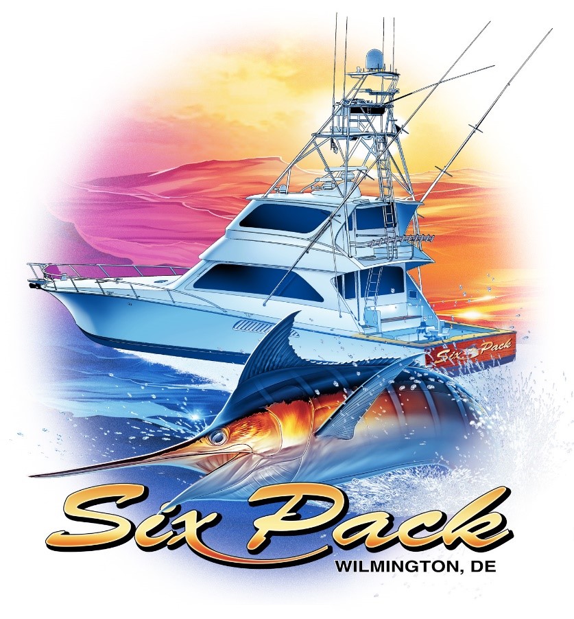
Our designers are aware that certain colors are closely associated with certain categories. For example, it is impossible to create a boating industry design without the tranquil blue of the water, the white of the wave as it crashes, and the sky whether in a perfect blue or a multiple color sunset of purples, reds, and oranges. Our team knows how to use the colors of the design to the advantage of the design and the intended target audience. It shows in every design, not just our boating designs we have created, but also in the automotive designs with the black of the road against the hot rod car colors. Regardless of the industry or category, we are skilled at matching the colors to hues quickly associated with the industry for a great outcome.
Main Image Flanked by Smaller Details
When creating a design, there needs to be a point of focus for the eye. We create this by having one central image such as a boat, car, or something related to your industry at the center of the design in a larger than life profile. This tells consumers right away what your industry is while giving the eye a place to focus. Many of our best designs are then flanked by smaller details surrounding the larger focal point. For example, a boating design may feature the boat as the focal point, but it is flanked by smaller details the eye notices second such as fish, crystal water, palm trees, or a clear sky. The backdrop is just as important as the main focus and it shows in every detailed depiction our team creates.
Seamless Integration of Multiple Colors
We believe in the use of stunning colors to catch the eye. While other designers may use several colors at once and it creates a clash, our team of experts knows how to layer colors without a clash or overpowering the eyes. Many of our designs use a few anchor colors and then add in gentle contrasting colors to create a pop visually without being overpowering.
Fine Line Between Animated and Realistic
When looking at our designs, you will find a fine line between realism and animated appeal. A fully realistic rendering would usually come off as too harsh for most designs, whereas something too animated would look like a cartoon. There is nothing wrong with doing with a more animated option for certain businesses looking for a playful, whimsical charm, but the fine line we walk between fully realistic and fully animated helps to create certain hallmarks that are pleasing to the eye. It gives a fun element without looking too juvenile. It also helps create soft lines and colors that are pleasing to look at for your customers. A slightly animated appearance is also more noticeable to the eyes when scanning since we are used to seeing more realistic images so it helps your brand stand out.