Designing your own custom apparel can be a tricky thing. Everyone loves a great t-shirt, but not everyone understands what goes into creating a great design. If your goal is to inspire people to wear your apparel over and over again, there are several design decisions you will want to avoid. In this guide, we take a closer look at 10 design mistakes that people frequently make when designing custom apparel and promotional items. With some helpful tips along the way, you can avoid these design disasters, get to work on your printed masterpiece, and take pride in the final product.
Top 10 Design Mistakes to Avoid
- Sizing: When it comes to t-shirt design, size matters a lot. Size should be based on the nature of the design and the properties of the garment you have chosen. A logo doesn’t have to be large and in charge to draw attention to your brand. In fact, potential wearers may appreciate the fact that you opted for a simple, standard size design.
- Placement: Don’t make the mistake of assuming that the center of the standard front print area of a t-shirt is the actual center of the t-shirt. Otherwise, you will end up with a belly print that won’t be very flattering on anyone.
- Typography: Choosing a font type is an important aspect of t-shirt design, one that should not be taken lightly. As the visual component of your text or wordmark, typography will impact the way the final design is received. It is best not to choose an overused font or combine too many fonts, as this will create a dull or dizzying design.
- Composition: Have you ever seen a t-shirt design that looked totally disproportionate? Every aspect of a design should be arranged in relation to other elements, so it doesn’t seem too spaced out or bunched up in the long run.
- Image Quality: Want to avoid a blurry wordmark or pixelated photo? The quality of your art file has a lot to do with how the final design will look once it is printed. You should never resort to using a low-resolution image in design.
- Colors: A colorful design can be costly when it comes to screen-printing because every color you add amounts to more cost per item. But the colors you choose, or lack of colors, can significantly impact the way your design is received. You may also be able to use halftones, which can make three or four colors look like many more.
- Contrast: In addition to color choice, you have to think about the degree of visual difference between the dark and light parts of your design. An eye-catching image full of saturated colors looks great against a neutral background.
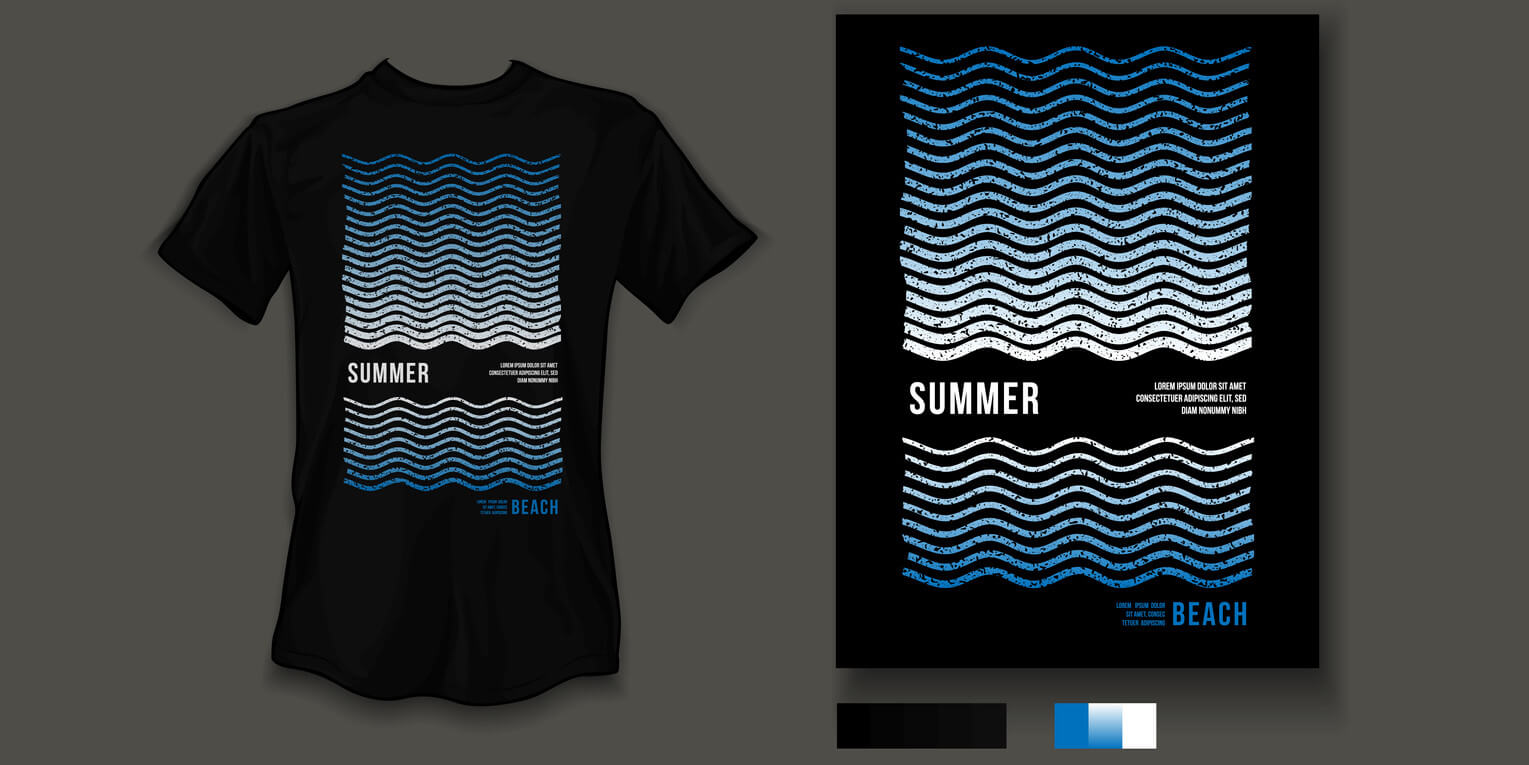
- Inversion: When printing white ink on black garments, inversion is an element that will keep your design from looking like an x-ray. Finding the right balance between positive and negative imagery will lead to a great design.
- Complexity: Another mistake that many people make is trying to make too much work in a confined space. When in doubt, keep it simple, because the human eye can only process a finite amount of information at a time.
- Borders, Masks, and Edges: Getting into the nitty-gritty of t-shirt design, there are a lot of choices when it comes to perfecting a design and keep it from looking too plain. Your artwork might look best with a thin white or black border, but you can also choose to accent your artwork with a frame or eliminate the background completely.
At MSP Design Group, we have all the necessary experience to help you bring your vision to life. In addition to offering a vast selection of promotional apparel to choose from, we also offer embroidery, screen-printing, and design services that can help you create one-of-a-kind clothing. Please feel free to contact us with any design questions or concerns.